
Jessie J - Who you are
The font size of this advert is very big and bold alongside it being printed in gold, which is bright and vibrant. This is used to capture the audiences attention. Moreover, the key information such as the album name, songs and collaborative artist is printed clearly in white and gold on a black background and this is to, again, draw the audience's attention. The use of including a collaborative artist in bold writing could be used to persuade a wider audience to buy her new album. Going back to the artist's name, it is printed in the centre of the advert and this draws the eye of the audience immediately. The use of a mid close up shot is used to promote the artist herself, but to also make aware to the audience or her fans of new information. Lastly, at the bottom of the information in the advert there is a website which informs the audience if they go onto the following html they can find more information about her new album; this is particularly catchy to fans.
Arctic Monkeys - A.M
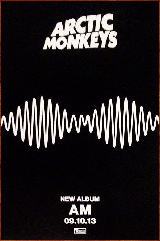 To begin with, the album advert is very simplistic and monotone. This could be because it gives off a mature theme behind it. In addition to this, the advert itself is less complex which allows the audience to follow key information and details of the new album. The font is bold, white with a personalised style which gives off the impression that the audience will immediately recognise the band. Compared to the bold and big writing of the bands name, the new album does not however seem to be as big as the writing above, along with the "new album" and the date in which it was/ would have been released. In contrast to this, the main focal point of this advert is the album artwork. This is the biggest as it would promote the image of the new album cover. Therefore, the audience would have to look out for this album artwork in order to relate it back to the album. An indiscreet idea used on this advert is the use of including the album name "AM" in the centre of the sound wave. This makes it all the more cleverer. Alongside this, the producer's logo is at the bottom of the advert and this is used to not only promote the artist, but to also promote the producing company too as the audience may be attracted to similar types of music by different artists signed to this company.

No comments:
Post a Comment