Friday, 22 April 2016


Thursday, 21 April 2016
Evaluation Questions
Q1: In what ways does your media product use, develop or challenge forms and conventions of real media products?
Q2: How effective is the combination of your main product and our ancillary tasks?
Q3: What have you learned from your audience feedback?

Q4: How did you use media technologies in the construction and research, planning and evaluation stages?
Wednesday, 20 April 2016


Thursday, 14 April 2016

Sunday, 10 April 2016
Digipak finished!


Above is what our finished digipak would look like. On the top left hand corner is what the back of our digipak would include, this being our tracklist along with our production company, barcode and copyright information. Next to it, is what the sidebar of our digipak would include. This entails our artists name and song along with both logos. On the top right is the front which includes a mid shot of the artist (promoting our star image - Richard Dyer) along with our artist name and album name. We have decided to keep our artist name "Envie" bigger than the album name as we found this was a common convention in the indie pop genre, as well as understanding through research that artists names are used to entice the audience. Below (left) is a plain black CD with again just our album and artist name, and this is because we felt that too much colour would be distracting to our target audience. Finally beside it is a mid/wide shot poster of the artist sitting on a bench alone in a bright and isolated area.
Saturday, 9 April 2016
Magazine Advert
Here is our finished magazine advert promoting our new album 'Good Intentions' by our artist name 'Envie'.

Friday, 8 April 2016
Magazine Album Analysis
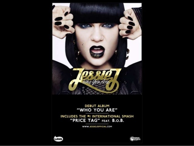

Jessie J - Who you are
The font size of this advert is very big and bold alongside it being printed in gold, which is bright and vibrant. This is used to capture the audiences attention. Moreover, the key information such as the album name, songs and collaborative artist is printed clearly in white and gold on a black background and this is to, again, draw the audience's attention. The use of including a collaborative artist in bold writing could be used to persuade a wider audience to buy her new album. Going back to the artist's name, it is printed in the centre of the advert and this draws the eye of the audience immediately. The use of a mid close up shot is used to promote the artist herself, but to also make aware to the audience or her fans of new information. Lastly, at the bottom of the information in the advert there is a website which informs the audience if they go onto the following html they can find more information about her new album; this is particularly catchy to fans.
Arctic Monkeys - A.M
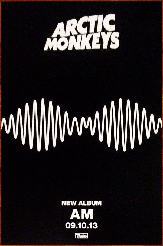 To begin with, the album advert is very simplistic and monotone. This could be because it gives off a mature theme behind it. In addition to this, the advert itself is less complex which allows the audience to follow key information and details of the new album. The font is bold, white with a personalised style which gives off the impression that the audience will immediately recognise the band. Compared to the bold and big writing of the bands name, the new album does not however seem to be as big as the writing above, along with the "new album" and the date in which it was/ would have been released. In contrast to this, the main focal point of this advert is the album artwork. This is the biggest as it would promote the image of the new album cover. Therefore, the audience would have to look out for this album artwork in order to relate it back to the album. An indiscreet idea used on this advert is the use of including the album name "AM" in the centre of the sound wave. This makes it all the more cleverer. Alongside this, the producer's logo is at the bottom of the advert and this is used to not only promote the artist, but to also promote the producing company too as the audience may be attracted to similar types of music by different artists signed to this company.
Friday, 1 April 2016
Theorists
Todorov's theory suggests that a narrative is simply equilibrium, disequilibrium and new equilibrium. However it could also include recognition of the disequilibrium and an attempt to repair the damage and disruption as shown below in my prezi.
Below I had found a slideshare of what the Uses and Gratification theory was. In the 1960's it was apparent to media theorists that audiences made their own choice when consuming media texts. Researchers Blumier and Katz expanded this theory and published their own in 1974.
Sunday, 27 March 2016
Evaluation questions..
Below are our evaluation questions that we have to answer now that we have completed our final product, that being our music video.
- In what ways does your media product use, develop or challenge forms of real media products?
- How effective is this combination of your main product and ancillary tasks?
- What have you learned from your audience feedback?
- How did you use media technologies in the construction and research, planning and evaluation stages?
Tuesday, 22 March 2016
Audience feedback from showcase evening
Here is a vlog about the audience feedback we got back on the night of the showcase.
Beneath is a video filmed on my iPhone of some of our audiences feedback, from the night of the showcase.
Beneath is a video filmed on my iPhone of some of our audiences feedback, from the night of the showcase.
Below are our audience feedback questionnaires filled in by our audience, whilst they were watching our music video ...

Saturday, 19 March 2016
Final product finished!
We have finally finished editing our footage and editing our music video together. Below is our finished final product.
Monday, 14 March 2016
Media showcase!
Today we had our media showcase, which showed both the AS two minute film openings and the A2 music videos. at the beginning of each music video, one or two people from each group had to explain briefly their song and what to expect (depending if they wanted their audience to know what is happening in the video). Below is our showcase opening...
In my opinion, I felt this was a huge success because we got to see personally our audiences views and expressions whilst watching the video. At the end of the showcase, we had the opportunity to interview some of our audience asking them questions like "what did you understand about our narrative in our video?", "what did you think about the different colour changes in the scenes? like black and white to colour" and "what was your interpretation of the ending?". We had loads of different views which was a really good approach.
Thursday, 10 March 2016
Digipak
With our digipak almost complete, all we have to do now is insert one image from our music video inside the digipak itself. Below is the layout we, as a group, have decided to use.

Below is our digipak front and back. We are still in the process of deciding whether or not we are going to keep our cd blank or layer an image over it so when the purchaser lifts the cd up, the same image embedded onto the cd will appear beneath.

{Front of our digipak}

{Back of our digipak with all the track listings and additional information at the bottom}
I think that for our insert photo that is going to be beside the CD is going to be a still shot from our music video. This being the long/wide shot of our artist sitting on the bench by herself looking straight towards the camera.
Friday, 4 March 2016
So what's left to edit?
With us nearly completing our music video, the only thing left to do now is edit the last pieces and include our band name and title of the song. Here is a tester of where our title is going to be placed.


We are not sure whether or not we are going to keep this, but this is just an experiment of what it would look like. I feel that the title of the song being in white is effective, because it relates to the colour of the small lies (signified/signifier - F. Saussure).
Our first draft....
Here is our music video in the making. We have edited most of the video itself, now we are just finalising a few things and editing a few more sections. For example at 2:21-2:27 we need to make it much more choppy. Overall we are happy with the final outcome.
Monday, 29 February 2016
Taking inspiration
In our music video, we have decided to alternate between black and white and colour. The narrative of our video is in black and white, yet the "honest" side to our protagonist and how she feels is in colour. This can be related to A-ha's - Take on me music video.
I feel that our music video is relatable to theirs as our narrative shows that our protagonist is showing a side that she feels like she does not belong. Like in a-ha's video the narrative shows that she wants to be apart of this graphic novel, however ours differs slightly as our protagonist wants to be free from her hiding her true emotions.


Tuesday, 23 February 2016
Inspirational video
We have decided to keep certain shots from Years and Year's 'Take Shelter' because from our prelim experience of inserting shots taken from the first 30 seconds of the video, we thought it would be effect in our final product.
Subscribe to:
Posts (Atom)